Bike Rentals

Excess Rentals in TFL Bike Sharing
How did the bike rentals volume fluctuate in the last years? The data comes from public Government data on Tlf bike sharing and can be downloaded from this link. We will use TfL data on how many bikes were hired every single day. We can get the latest data by running the following:
url <- "https://data.london.gov.uk/download/number-bicycle-hires/ac29363e-e0cb-47cc-a97a-e216d900a6b0/tfl-daily-cycle-hires.xlsx"
# Download TFL data to temporary file
httr::GET(url, write_disk(bike.temp <- tempfile(fileext = ".xlsx")))
## Response [https://airdrive-secure.s3-eu-west-1.amazonaws.com/london/dataset/number-bicycle-hires/2020-09-18T09%3A06%3A54/tfl-daily-cycle-hires.xlsx?X-Amz-Algorithm=AWS4-HMAC-SHA256&X-Amz-Credential=AKIAJJDIMAIVZJDICKHA%2F20200919%2Feu-west-1%2Fs3%2Faws4_request&X-Amz-Date=20200919T224752Z&X-Amz-Expires=300&X-Amz-Signature=a18923e87aab7725bbc1c87abf21b03daf8c067853e7c51fde1af0d5d5e12782&X-Amz-SignedHeaders=host]
## Date: 2020-09-19 22:47
## Status: 200
## Content-Type: application/vnd.openxmlformats-officedocument.spreadsheetml.sheet
## Size: 165 kB
## <ON DISK> C:\Users\Public\Documents\Wondershare\CreatorTemp\RtmpAdINEQ\file5a446fb0505f.xlsx# Use read_excel to read it as dataframe
bike0 <- read_excel(bike.temp,
sheet = "Data",
range = cell_cols("A:B"))
# change dates to get year, month, and week
bike <- bike0 %>%
clean_names() %>%
rename (bikes_hired = number_of_bicycle_hires) %>%
mutate (year = year(day),
month = lubridate::month(day, label = TRUE),
week = isoweek(day),
dayy=day(day))We can see the distribution of bikes for 2019 and 2020 in the following graph:
bike_first<-bike %>%
  filter(year>=2019 )

bike_first
## # A tibble: 609 x 6
## day bikes_hired year month week dayy
## <dttm> <dbl> <dbl> <ord> <dbl> <int>
## 1 2019-01-01 00:00:00 14148 2019 Jan 1 1
## 2 2019-01-02 00:00:00 19746 2019 Jan 1 2
## 3 2019-01-03 00:00:00 21552 2019 Jan 1 3
## 4 2019-01-04 00:00:00 20863 2019 Jan 1 4
## 5 2019-01-05 00:00:00 13907 2019 Jan 1 5
## 6 2019-01-06 00:00:00 14262 2019 Jan 1 6
## 7 2019-01-07 00:00:00 25668 2019 Jan 2 7
## 8 2019-01-08 00:00:00 27757 2019 Jan 2 8
## 9 2019-01-09 00:00:00 26568 2019 Jan 2 9
## 10 2019-01-10 00:00:00 26022 2019 Jan 2 10
## # ... with 599 more rowsggplot(bike_first, aes(x=dayy, y=bikes_hired, fill='red'))+
geom_line(aes(x=dayy, y=bikes_hired))+
#facet_grid(year~month, scales='free_x')+
facet_wrap(~ year + month, ncol = 12, scales = "free_x")+
#scale_y_continuous(breaks=seq(0, 5000, by = 2500))
theme_minimal()+
theme(aspect.ratio=2/1.5)+
labs(title='Tlf bike rentals fluctuations',
x=NULL,
y='Bike rentals',
caption = 'Source:Tlf, London Data Score')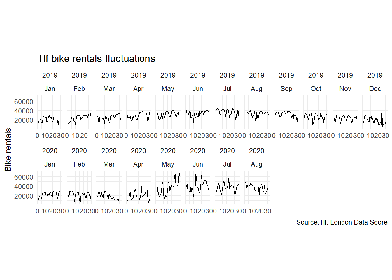
  #theme(strip.text.x = element_text(size=2, angle=75),
         # strip.text.y = element_text(size=2, face="bold"),
         # strip.background = element_rect(colour="red", fill="#CCCCFF"))
From the graph, we could see high discrepancies in the number of bike rentals during February-April, a change that may be due to Coronavirus restrictions. To further investigate that, we are going to compare volumes of bikes rentals across years.
Next, we will reproduce 2 graphs presented in LBS Statistics with R course.
##Chnage from montly expected bike rentals
### Data Wrangling for calculationg the expected and excess rentals
I will first wrangle the data to adapt it to our needs. In the following chunk, we calculate 2 dataframes: `bike_expected` and `bike_avg`. The former has the expected trends (blue line on the plot), the latter will have the actual trend (thin black line on the plots). The I will join them using `left_join()`.
### Mean or median?
We are going to use median for these purposes. That is because the median is much less affected by outliers and extreme values, such as those occurring during 2020, as it is simply the value in the middle between the higher and lower half of a given range. It is therefore much better at reflecting the true expected or 'middle' trend.
```r
#calculate expected number of bikes to be hired per month
bike_expected<-bike %>%
filter(year>= 2015 & year<2020) %>% #we do not take 2020, since we do not have observations from the entire year
group_by(month) %>%
summarize(expected_per_month = median(bikes_hired)) %>%
select(month, expected_per_month)## `summarise()` ungrouping output (override with `.groups` argument)# Show results
kable(head(bike_expected,5))| month | expected_per_month |
|---|---|
| Jan | 21816.0 |
| Feb | 23169.0 |
| Mar | 24559.0 |
| Apr | 28818.5 |
| May | 33192.0 |
#calculate average bike hires
bike_avg<-bike %>%
  filter(year>= 2015 & year<=2020) %>%
  group_by(month, year) %>%
  summarize(average_per_month = median(bikes_hired)) %>%
  select(month, average_per_month, year)
## `summarise()` regrouping output by 'month' (override with `.groups` argument)# Show results
kable(head(bike_avg,5 ))| month | average_per_month | year |
|---|---|---|
| Jan | 21405 | 2015 |
| Jan | 20948 | 2016 |
| Jan | 22122 | 2017 |
| Jan | 23374 | 2018 |
| Jan | 24357 | 2019 |
#unite the two calculations
#we join the two tables on the 'month' variable, in order to have both expected and actual number of bikes rentals
big_table<-left_join(bike_avg, bike_expected, by='month') %>%
  mutate(date = ymd(paste(as.character(year), as.character(month), "1")), #get dates
         bottom_line=ifelse(average_per_month>expected_per_month,expected_per_month,average_per_month)) #minimum of both curves everywhere
# Show Results
kable(head(big_table, 5))| month | average_per_month | year | expected_per_month | date | bottom_line |
|---|---|---|---|---|---|
| Jan | 21405 | 2015 | 21816 | 2015-01-01 | 21405 |
| Jan | 20948 | 2016 | 21816 | 2016-01-01 | 20948 |
| Jan | 22122 | 2017 | 21816 | 2017-01-01 | 21816 |
| Jan | 23374 | 2018 | 21816 | 2018-01-01 | 21816 |
| Jan | 24357 | 2019 | 21816 | 2019-01-01 | 21816 |
Plotting
Now we can plot this:
big_table %>%

  ggplot(aes(x=month))+
  facet_wrap(~year)+

  #green and red bands
  geom_ribbon(aes(ymin=bottom_line,ymax=expected_per_month, group=year), fill="#EAB5B7")+ #red band: between bottom and expected_per_month
  geom_ribbon(aes(ymin=bottom_line,ymax=average_per_month, group=year), fill="#CBEBCE")+ #green band: between bottom and avg_per_month

  #plot line curves
  geom_line(aes(y = average_per_month, group=year), size = 0.3,color = "black") +
  geom_line(aes(y = expected_per_month, group=year), size = 0.6, color = "blue")+

  #aesthetics
  theme_minimal()+
  theme(aspect.ratio = 1/3,
        axis.text=element_text(size=6))+ #reduce text size in axes to avoid overlap
  labs(title='Montly changes in Tlf bike rentals',
       subtitle = 'Change from monthly average shown in blue and calculated between 2015-2020',
       x=NULL,
       y='Bike rentals',
       caption = 'Source:Tlf, London Data Score')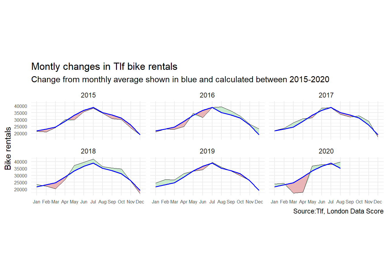
The blue line represents the average number of bikes computed monthly for the 2015- 2019 period. The thin black line represents the number of bikes rented in that specific year (computed monthly).When the number of bikes rented is smaller than the average of bikes per month (calculated from 2015-2019), the difference is depicted in red. Conversely, when the number is greater, the difference is depicted in green.
What happens on the graph?
On the graph, we can appreciate the a growing trend of bike hirings throughout the years. In the initial years of 2015 and 2016, the service was used less than average. This might be because the infrastructure of London was less suited to bikers than in later years. Through 2017 and 2018, the bike use is seen to rise. In 2020, a large decrease is once again noted in the early months of the year. This is due to the corona-virus restrictions which confined people to their houses. Upon the lifting of the restrictions, a large resurgence of bike use can be noticed, as people hired more bikes to enjoy the outdoors and their regained freedom of movement.
Percentages change from weekly average
The next graph looks at percentage changes from the expected level of weekly rentals. The two grey shaded rectangles correspond to the second (weeks 14-26) and fourth (weeks 40-52) quarters.
Data Wrangling for next Graph
We will wrangle this data again. We will create the bike_avg_week to estimate the average per week around years 2015-2020, and the bike_expected_weekto appreciate the expected amount of hirings per week in 2015-2020.
# Avearage per week in 2015-2020
bike_avg_week<-bike %>%
  # Filter 2015-2020
  filter(year>= 2015 & year<=2020) %>%
  # Group by week
  group_by(week, year) %>%
  # summarise statistics (median)
  summarize(average_per_week = median(bikes_hired)) %>%
  # select vars of interest
  select(week, average_per_week, year)
## `summarise()` regrouping output by 'week' (override with `.groups` argument)# Show Results
kable(head(bike_avg_week, 10))| week | average_per_week | year |
|---|---|---|
| 1 | 9491.0 | 2015 |
| 1 | 20644.0 | 2016 |
| 1 | 18973.0 | 2017 |
| 1 | 15349.5 | 2018 |
| 1 | 15214.0 | 2019 |
| 1 | 15695.0 | 2020 |
| 2 | 20566.0 | 2015 |
| 2 | 22266.0 | 2016 |
| 2 | 20963.0 | 2017 |
| 2 | 24683.0 | 2018 |
# Average per week in 2015-2020
bike_expected_week<-bike %>%
  # filter 2015-2020
  filter(year>= 2015 & year<2020) %>%
  # group by week
  group_by(week) %>%
  # calculate median
  summarize(expected_per_week = median(bikes_hired)) %>%
  # select vars of interest
  select(week, expected_per_week)
## `summarise()` ungrouping output (override with `.groups` argument)# Show results
kable(head(bike_expected, 10))| month | expected_per_month |
|---|---|
| Jan | 21816.0 |
| Feb | 23169.0 |
| Mar | 24559.0 |
| Apr | 28818.5 |
| May | 33192.0 |
| Jun | 36708.0 |
| Jul | 38912.0 |
| Aug | 35108.0 |
| Sep | 33402.0 |
| Oct | 31069.0 |
And now we will join them
# Join data frames
big_table_week<-left_join(bike_avg_week, bike_expected_week, by='week') %>%
  mutate(change_week=(average_per_week-expected_per_week)/expected_per_week) %>%
  mutate(topline = ifelse(change_week>0, change_week, 0))
# Show results
kable(head(big_table_week, 10))| week | average_per_week | year | expected_per_week | change_week | topline |
|---|---|---|---|---|---|
| 1 | 9491.0 | 2015 | 15777.5 | -0.3984472 | 0.0000000 |
| 1 | 20644.0 | 2016 | 15777.5 | 0.3084456 | 0.3084456 |
| 1 | 18973.0 | 2017 | 15777.5 | 0.2025353 | 0.2025353 |
| 1 | 15349.5 | 2018 | 15777.5 | -0.0271272 | 0.0000000 |
| 1 | 15214.0 | 2019 | 15777.5 | -0.0357154 | 0.0000000 |
| 1 | 15695.0 | 2020 | 15777.5 | -0.0052290 | 0.0000000 |
| 2 | 20566.0 | 2015 | 22285.0 | -0.0771371 | 0.0000000 |
| 2 | 22266.0 | 2016 | 22285.0 | -0.0008526 | 0.0000000 |
| 2 | 20963.0 | 2017 | 22285.0 | -0.0593224 | 0.0000000 |
| 2 | 24683.0 | 2018 | 22285.0 | 0.1076060 | 0.1076060 |
Now, we can construct the desired plot
ggplot(data = big_table_week, aes(x=week, y=change_week, group=year))+
  geom_line()+

  #facet by year
  facet_wrap(~year)+

  #add grey vertical bands in background
  annotate("rect", xmin=13, xmax=26, ymin=-Inf, ymax=Inf, alpha=0.4, fill="grey") +
  annotate("rect", xmin=39, xmax=53, ymin=-Inf, ymax=Inf, alpha=0.4, fill="grey") +

  #add red and green bands between curve and y = 0
  geom_ribbon(aes(ymin=0,ymax=change_week), fill="#CBEBCE", color="black", size=0.05)+ #green
  geom_ribbon(aes(ymin=change_week, ymax=topline), fill="#EAB5B7", color="black", size=0.05) + #red\

  #tick marks on bottom axis
  geom_rug(data = . %>%  filter(change_week <= 0), sides="b", color='#EAB5B7', size = 0.8) + #filter to color only the ticks where change_week < 0 red
  geom_rug(data = . %>%  filter(change_week > 0), sides="b", color='#CBEBCE', size = 0.8) + #green

  #horizontal line at y = 0
  geom_hline(yintercept = 0, size=0) +

  #aesthetics
  scale_y_continuous(expand = expansion(mult = .05),
                     labels=scales::percent)+ #y-axis lables
  theme_minimal()+
  theme(aspect.ratio = 1/2) + #wider
  labs(title = "Weekly changes in TfL bike rentals", # add labels to the df
       subtitle = "% changes from weekly averages calculated between 2015-2019",
       caption = "Source: fivethirtyeight.com - 2014", # Source
       y = NULL)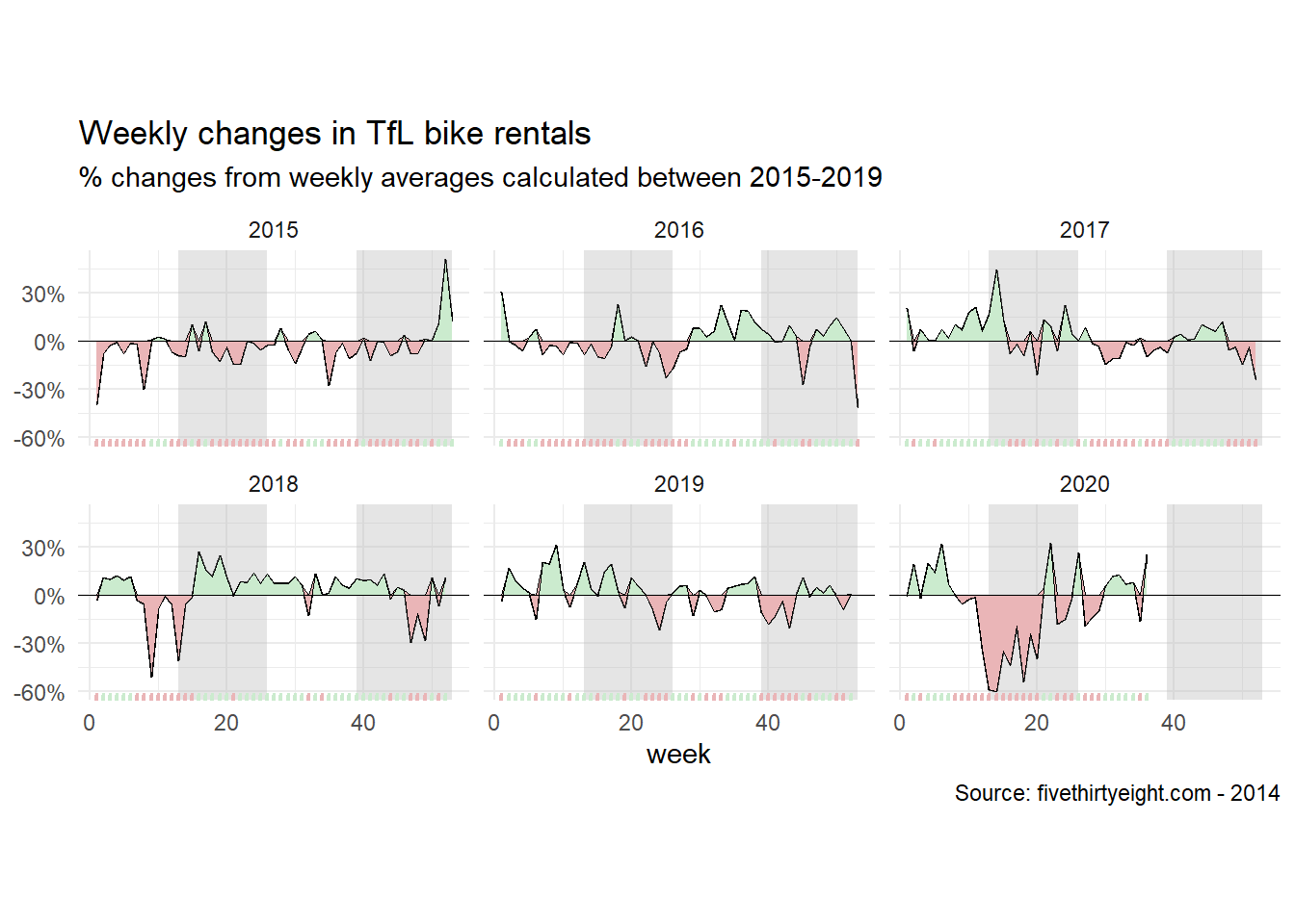
The above graph tells largely the same story as the graph shown earlier in the discussion, only this time displayed as changes with respect to a weekly average. We can once again appreciate a growing populatiry of bike use from 2015 through to 2019, a major decrease during the pandemic of early 2020, and a resurgence upon the lifting of the restrictions.